Web Design
The Big Chill Festival website redesign is a web-based user interface project focused on improving the overall experience for festival attendees. This project involved a full visual and structural redesign of an outdated event website, including the addition of a ticketing flow, mobile app promotion, kiosk integration, and social media engagement.
The original website lacked visual hierarchy, clear navigation, and actionable pathways for users. My role was to identify these usability problems and redesign the interface to improve clarity, branding, and engagement across both desktop and kiosk platforms. I was responsible for UX research, concept development, and UI execution using industry-standard design tools.

Process
1 . PROJECT OVERVIEW

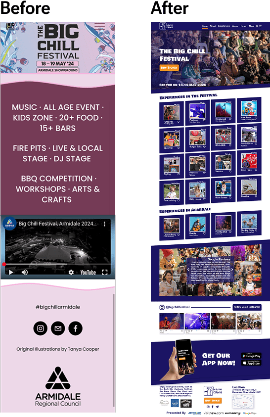
CURRENT WEBSITE OVERVIEW
- Soft colors and large logo, but lacks visual contrast.
- Minimal navigation (no Tickets or App links).
- Key info is buried in long text blocks.
- Only one YouTube video and small social icons.
- No strong call-to-action or clear user flow.
- Not mobile/kiosk optimized.
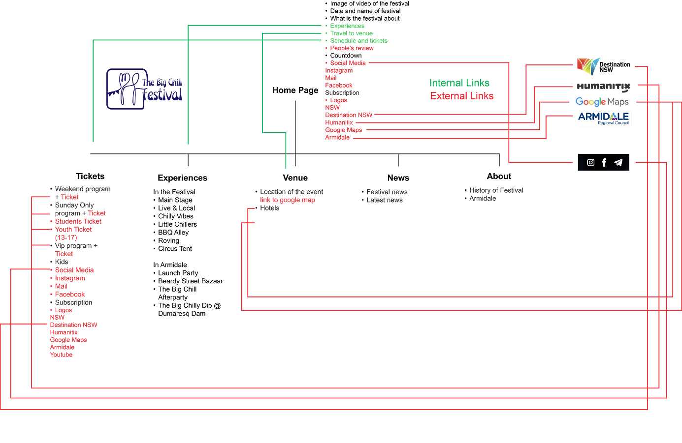
CURRENT SITEMAP
The Big Chill Festival website has useful content but is poorly structured. Navigation is confusing, with repeated items like social links and hashtags on every page.
- No clear ticketing path or Buy Now button
- Overloaded sections (e.g., “What’s On” mixes too many topics)
- Visual clutter from mixed links and logos
- Not mobile-friendly or ready for future features
Key Issues:
2 . PROCESS AND RESEARCH
COMPETITOR ANALYSIS
OZASIA FESTIVAL
Smart, colorful, and performer-focused event site.
COMPETITOR INSIGHTS
Uses color to separate content, making navigation clear and sections easy to scan.
Highlights multiple festivals at the top, which is great for partner promotion.
Strong performer showcase with images and “more” buttons improves engagement.
Helpful search icon improves usability for all users.
BLEACH FESTIVAL
Clean structure with clear program planning.
COMPETITOR INSIGHTS
Sticky top navigation bar is easy to find and use.
Includes both search and shopping icons for better functionality.
Well-divided sections with visuals make it organized and readable.
Footer is bold and branded with partner logos and contact details.
BLUESFEST
Energetic, action-driven site with strong calls to action.
COMPETITOR INSIGHTS
Bright "Buy Tickets" button is central and eye-catching.
Uses a gallery to show the event atmosphere visually.
Spotify playlist builds pre-event excitement and brand vibe.
Footer includes location with a Google Map for quick info access.
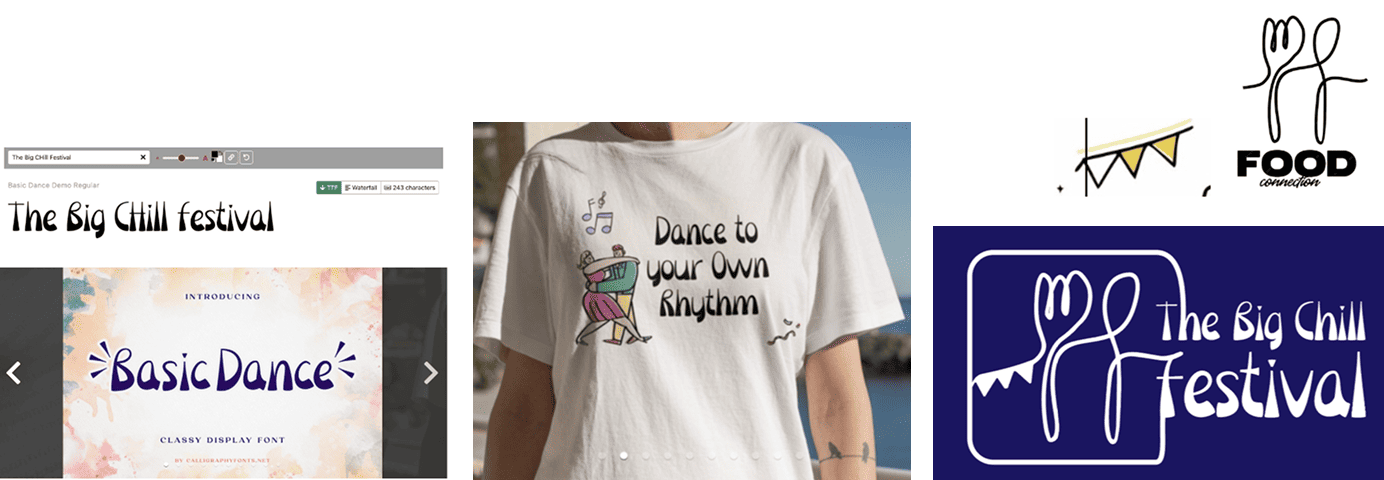
BRAND DEVELOPMENT
- Developed a new logo combining spoon, fork, and dancing figures to represent food, fun, and music.
- Designed visual identity that’s playful and inclusive — suited for all ages.
- Chose "Basic Dance" font to reflect energy, rhythm, and creativity of the festival.
- Created early sketches and refined them into a modern, festival-friendly brand mark.
- Showcased the logo on mockups like t-shirts to visualize branding in real-life use.
FINAL SITEMAP
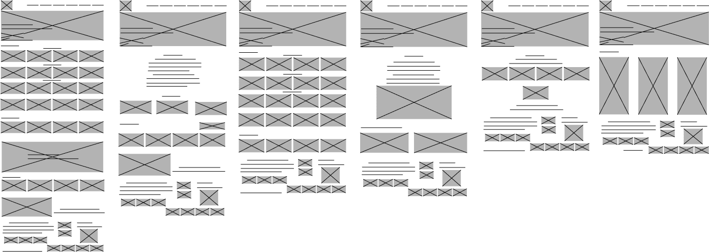
WIREFRAMING
3 .DESIGN OUTCOMES
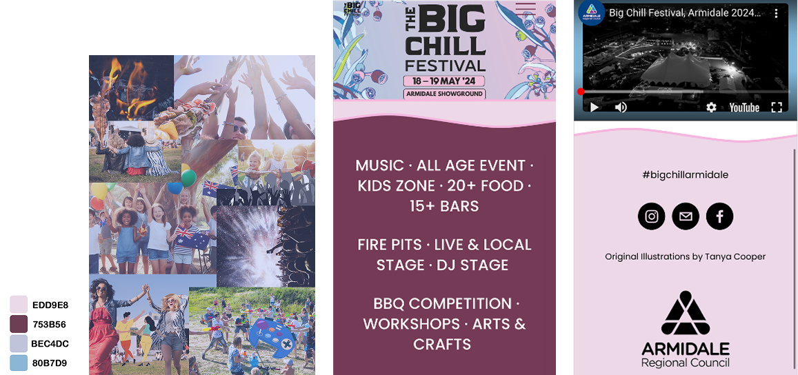
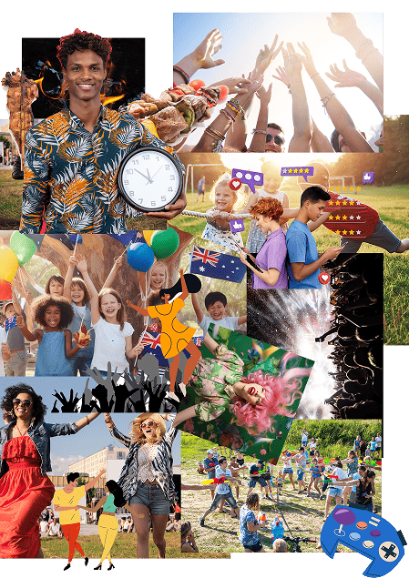
MOODBOARD
The Post-Design Moodboard visually expresses the energy and diversity of the Big Chill Festival. It captures:
- Joyful crowds, live music, family fun, and outdoor activities
- Warm lighting, movement, and community spirit
- A mix of real photos and illustrations to emphasize inclusivity and playfulness
- Key themes: fun, connection, celebration, and creativity
This moodboard guided color, imagery, and layout choices throughout the final design.
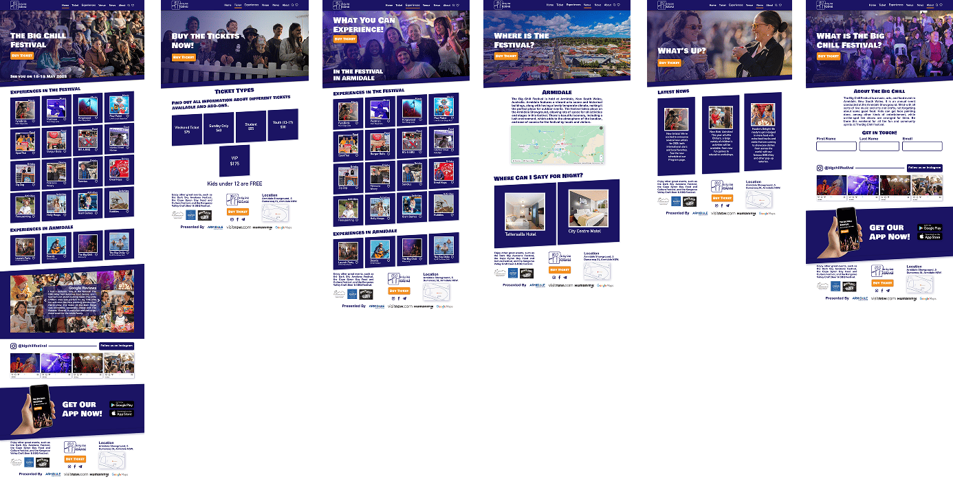
FINAL DESIGN
4 .REFLECTION AND IMPACT
IMPROVEMENTS
- The old website was flat, outdated, and lacked structure.
- The new design is vibrant, organized, and centered on user needs.
- Strong visual hierarchy and engaging CTAs (“Buy Ticket” & “Download App”).
- Clear navigation, informative pages, and immersive festival previews.
- Integrated Humanitix flow, Google Reviews, and Instagram feed.
- Mobile-ready and kiosk-compatible for real-world use.