SnackTime
SnackTime is a mobile app that lets cinema visitors order snacks from their seats without missing the movie. I noticed that families and elderly people had trouble getting snacks during the film, so I designed an easier solution.
This project focused on creating a user-friendly app that works well in dark cinema settings. I designed two versions (light and dark mode), created user flows and wireframes, and tested the prototypes with real users.
As the UX/UI Designer, I worked on research, design, and prototyping. My goal was to make snack ordering simple, fast, and accessible for everyone.

Process
1 . USER RESEARCH & INTERVIEWS
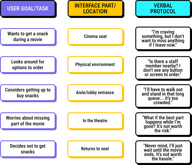
Think-aloud protocol
- User feels conflicted between enjoying the movie and satisfying hunger.
- No visible solution exists for in-seat snack ordering.
- Long lines and dark space discourage movement.
- User abandons the idea to avoid interruption.
Observations:
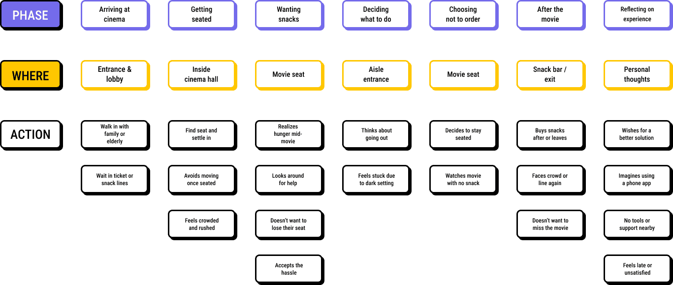
USER JOURNEY MAP
INSIGHTS
Parents find it hard to leave their seat without worrying about their kids.
"I can't leave my kids alone just to get snacks. I wish someone could bring them to us."
Sara, 36
Elderly users want simpler and more accessible options.
"It's tiring to go up and down the stairs or wait in a line. I'd love something easier."
James, 68
Young adults prefer fast and smooth ordering without missing the movie.
"By the time I get back with snacks, I’ve already missed the best part."
Simon, 24
Users want to order without disturbing others in the dark.
"It’s too dark to scan anything or see signs. I’d rather use an app with big buttons."
Lily, 31
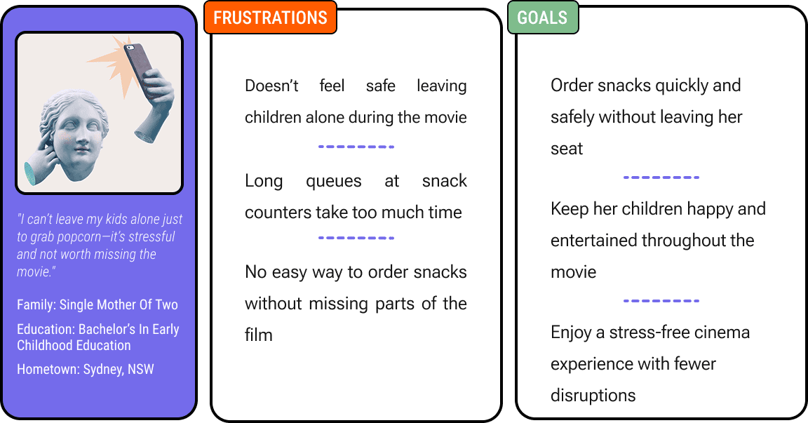
PERSONA, SARA, 36
Sara is a single mother of two young children. She enjoys taking her kids to the movies on weekends but finds it difficult to manage everything alone. She often worries about leaving her children unattended just to get snacks and doesn't want to miss parts of the movie. Her experience could be better with a simple, in-seat ordering solution.
Problem statement:
Sara is a caring and responsible mother who needs an easier way to order snacks during movies because leaving her seat disrupts both her and her children’s experience.
2. IDEATION & USER FLOW & PROTOTYPE
DON NORMAN’S DESIGN PRINCIPLES
Visibility
Show clear images, names, prices.

Feedback
Confirm each action instantly.
Constraints
Require seat number before checkout
Mapping
Layout matches user expectations
Consistency
Unified colors, fonts, layout

Affordance
Buttons look tappable / interactive.
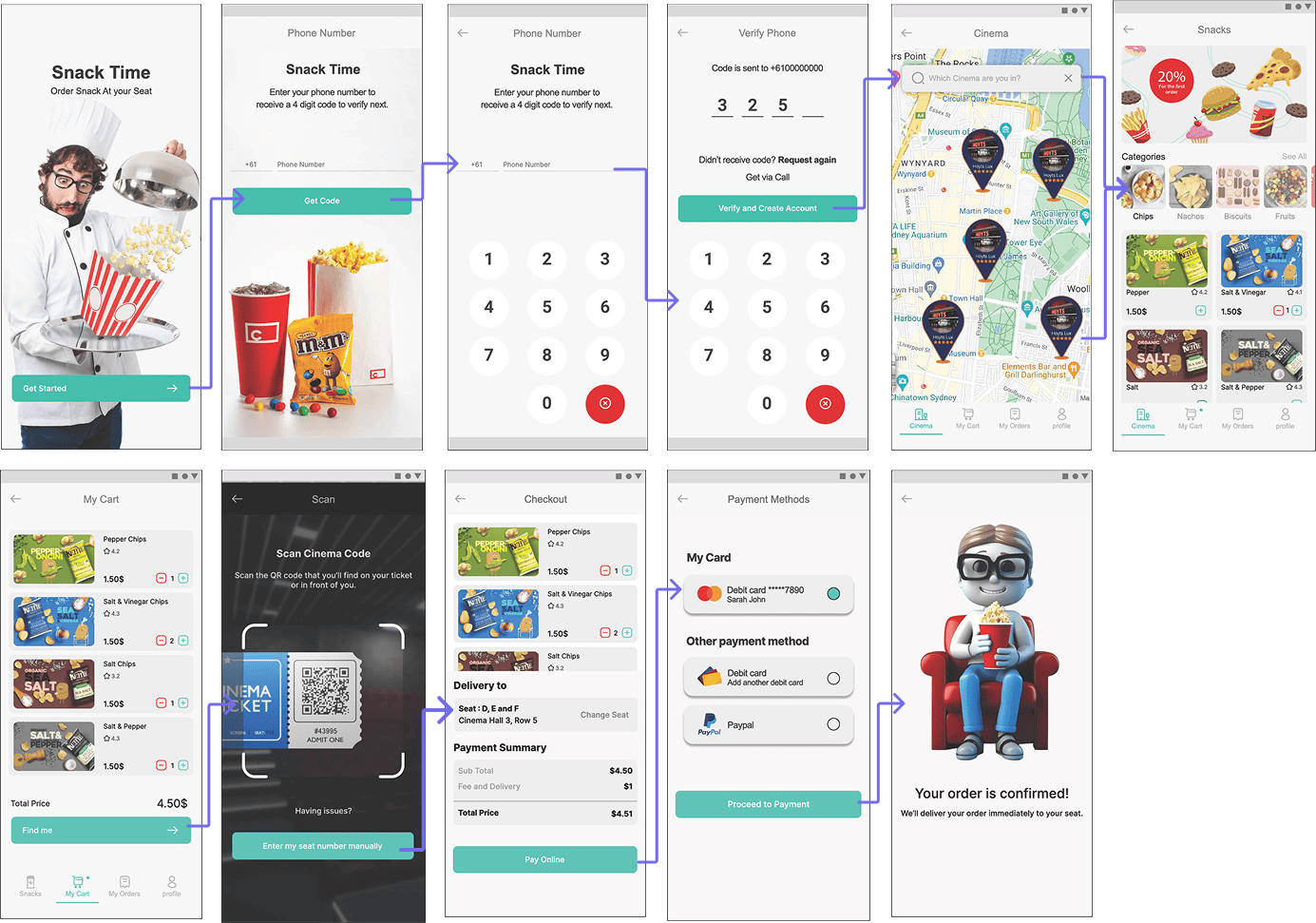
USER FLOW

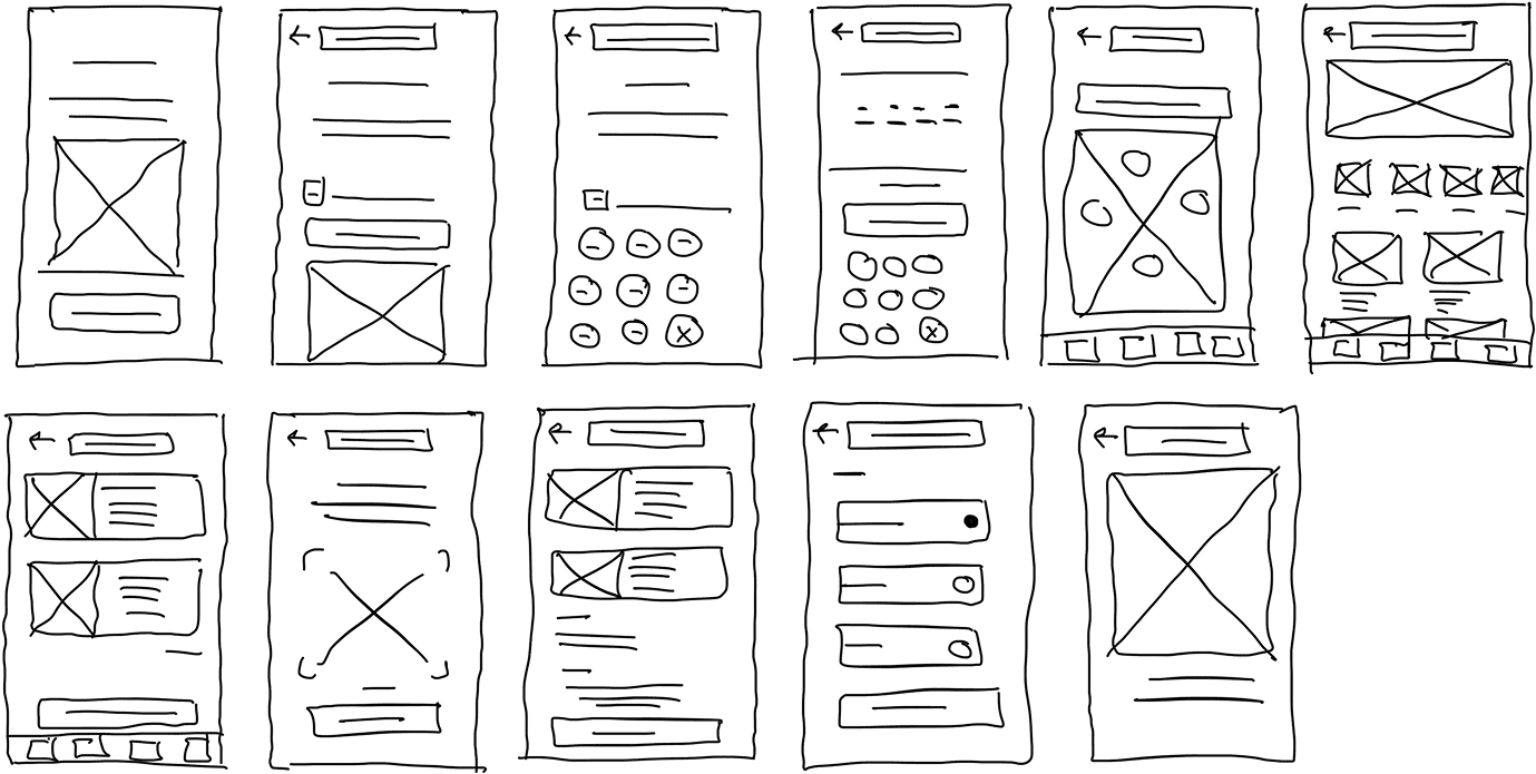
WIREFRAMING
FINAL DESIGN
POST-TESTING DESIGN IMPROVEMENTS
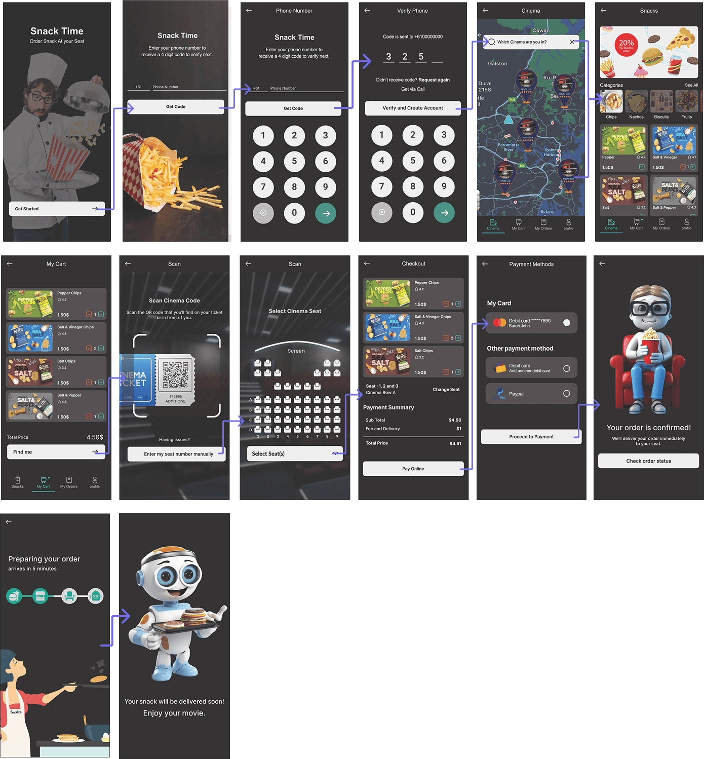
- All screens redesigned for low-light environments
- Improved visual contrast for better accessibility
DARK MODE UI
- Added subtle prompts (“Tap to start”, “Scan your ticket here”)
- Tooltips for new users to understand seat entry and order tracking
GUIDED ONBOARDING
- Real-time snack progress bar added: Ordered → Preparing → Out for Delivery → Delivered
- Robot illustration animates delivery for engagement
SNACK DELIVERY TRACKING
- Option to scan ticket QR or enter seat manually
- Seat map UI now supports multi-seat input with visual confirmation
CLEARER SEAT SELECTION
- Cleaner layout for card and PayPal options
- "Change seat" button on final checkout visible and intuitive
PAYMENT FLOW ENHANCEMENTS
- Redesigned illustrations with cinema avatars and delivery robot
- Consistent visual tone across all screens for fun and trust
ENGAGING VISUALS
- Hover or tap on snacks shows ingredient preview and nutrition tags
MORE SNACK INFO
FINAL DESIGN IMPROVEMENT
