Bus Display

ABOUT THE PROJECT
This project aimed to redesign bus stops and in-bus displays to support neurodivergent users in Sydney. The goal was to reduce anxiety and sensory overload through clear, calm, and inclusive interfaces.
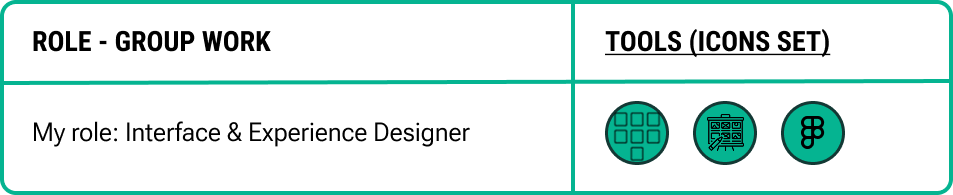
We researched user needs and created both physical and digital solutions using simplified visuals, real-time info, and tactile buttons. I led the interface design from early sketches to high-fidelity Figma prototypes.
Process
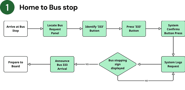
1 . PROJECT OVERVIEW
INSIGHTS
Sensory overload in loud environments (e.g. buses, terminals) causes stress for neurodivergent users.
"The noise and announcements give me headaches before the bus even comes."
Liam, 28
Too much information at once (e.g. many routes, long schedules) leads to cognitive overload.
"I get confused by all the numbers and can't tell which one is mine."
Ava, 22
Inconsistent signage and lack of color-coding make navigation harder across bus stations.
"Every stop looks different. I never know where to stand or where to look."
Mick, 35
Mobile apps and digital tools often overwhelm users with ADHD or dyslexia.
"I avoid the app. Too many tabs and buttons. It stresses me out."
Chloe, 19
USER NEED STATEMENT
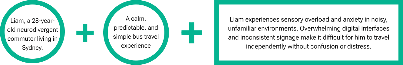
“Liam, a 28-year-old neurodivergent commuter who experiences sensory overload in unfamiliar environments, needs a calm, simple, and predictable navigation system that supports non-verbal cues, offers real-time guidance, and builds trust—so he can travel independently and comfortably on Sydney’s public buses.”
2 . IDEATE INCLUSIVE SOLUTIONS
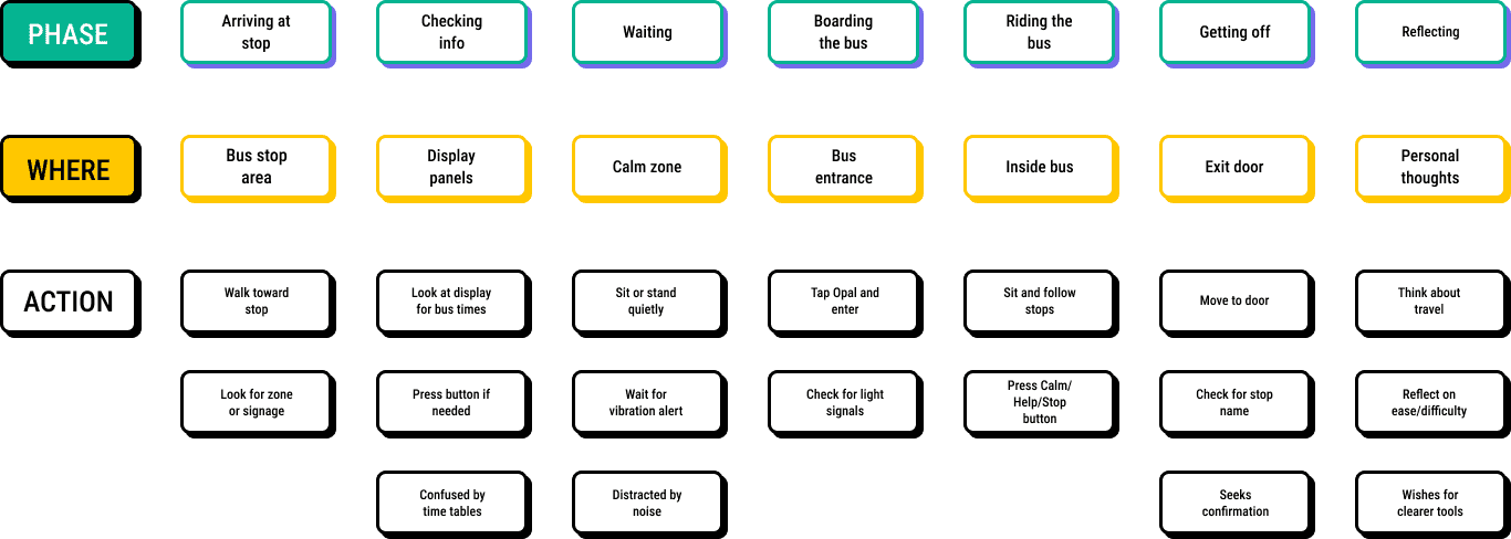
USER JOURNEY MAP
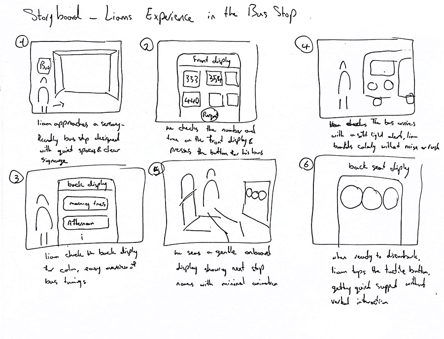
STORY BOARD
- Liam arrives at a calm, sensory-friendly bus stop.
- He checks the front display for his bus and presses the request button.
- He views the back display, which shows bus times in a clear day-part format.
- A soft light alerts him when the bus arrives, and he boards calmly.
- Inside, a gentle screen shows upcoming stops.
- When ready to get off, Liam taps a tactile stop button and exits quietly without needing to speak.
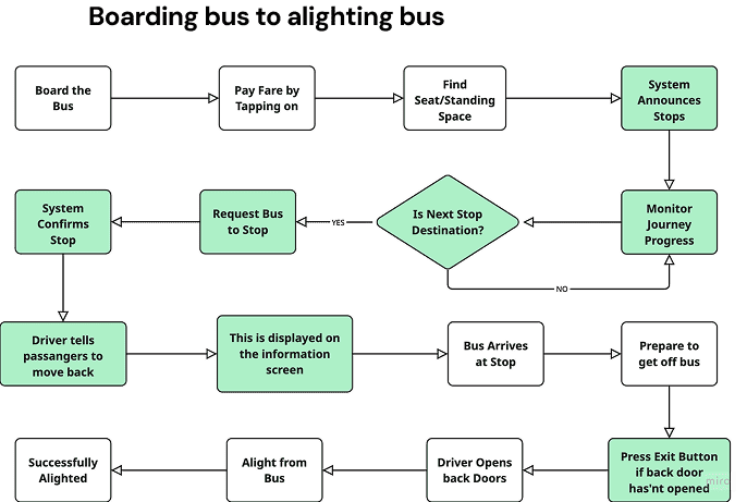
USER FLOW
3 . DESIGN & TEST INTERFACE
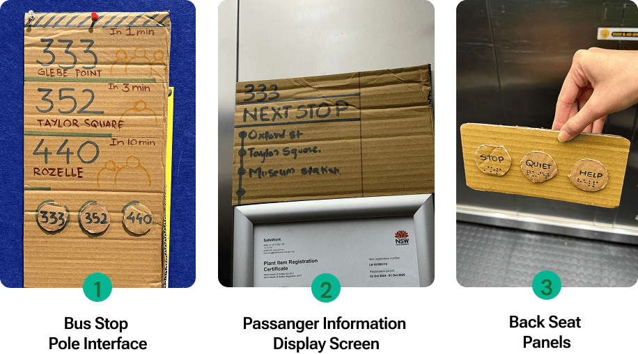
LOW-FIDELITY PROTOTYPE
user feedback:
98%
Didn’t understand green line indicators
80%
Felt pressing the button would create more anxiety
70%
Were unsure of the back panel
99%
Liked that we were introducing tangibility
95%
Liked the capacity icons
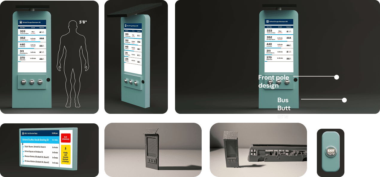
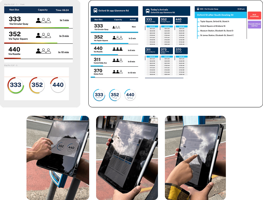
HIGH-FIDELITY SCREENS DISPLAY
user feedback:
90%
Front Pole Live Info Appreciated
Real-time bus numbers, capacity, and “stopping” labels reduced stress.
75%
Back Pole Full-Day View Helpful
Day schedule helped planning
85%
Preferred Physical Buttons
Pressing a button over hand-raising; glow feedback reassuring.
88%
Next Stops Display Reassured Users
List of next stops with icons/text built confidence during trip
90%
Concerns About Back Panel Button
privacy concerns and accidental press from luggage
2 . DELIVER THE FINAL DESIGN
FINAL DESIGN